This campaign is aimed at men, this is because on the advert, it is a man that is drinking the product that is being promoted. Also on the top right of the poster, it reads "MILK for REAL MEN" which has very strong connotations of the fact that the product is for male audiences.
The advert appeals strongly to male audiences because it denotes a very muscly looking man, hanging of what looks like a very high up cliff, with only one hand. This connotes that he is incredibly physically capable, and also very brave and strong. The advert connotes that this is because he drinks "MAXI-MILK". The word "REAL MEN" is the most noticeable word on the poster, because it is in the biggest font and is in a bright white colour. The phrase in it's self attracts male audiences, because it is very likely that the viewer's ideal version of themselves, consists of being seen by others as a real man. The colour white could be suggesting purity, which comes along with the idea that the man on the advert has achieved perfect health.
The denotation of the man climbing up a very difficult looking cliff could also be be connoting the idea that the man is overcoming the difficulties of life, with the help of "MAXI-MILK", the colour of the sky suggested that it was previously cloudy and grey (dull life) yet thanks to "MAXI-MILK" the weather is starting to clear up and become brighter, like the life he is living.
The constant message throughout this campaign was Mr T shouting at you to get some nuts. I think this means that the overall core message of the campaign is to buy snickers, because snickers contain nuts, therefore your are literally getting some nuts. The advert features Mr T, who will be recognised especially my males, who may have watched the A team, or Rocky IV.
The trailer shows a guy falling over while playing football and whining about it, when suddenly a tank drives over some cars (and crushes them) and drives onto the pitch. Mr comes out of the tank and tells the guy to "stop jibber jabbing", then the tank fires a snicker at the guy, and Mr T shouts at him telling him to "get some nuts". The overall message is that if you eat snickers, you will become more tough, just like Mr T. Also the connotations of the phrase "get some nuts" could be interpreted as "become more manly and toughen up by eating snickers". The reason that Mr T comes along in a tank is because he has now become the ultimate tough guy, and it is suggested that this is because he eats snickers. The reason why they are all playing football at the beginning because football is stereotypically very popular among male audiences, so they may start eating snickers because they think it will make them better at football.
(1)
In this web advert, the advert depicts Mr T holding a snickers, and point at the viewer. This poster has impact because Mr T is looking directly at you and almost looks intimidating because of his strength. He is holding a snicker bar, because that is what the advert is wanting you to buy, and the words "GET SOME NUTS" hang from a chain around Mr T's Nuts. Because this advert has the same narrative as the video advert, the campaign is successful as a whole, since the campaign has synergy.
(2)
In the campaign, even the product the campaign wants you to buy has the same message "GET SOME NUTS" printed on the campaign, and even has Mr T appear to be punching you in the face, with the SNICKERS logo printed on his fist, meaning Mr T is forcing you to buy snickers, which is humorous. To some customers, they may have seen Mr T on the snickers packet, and because he stared in films that the customer likes such as the A-Team and Rocky IV. The font for GET SOME NUTS is the same as it is on the video advert, which gives the campaign synergy, the packet also has almost the same narrative as the previous materials used in the campaign so far.
(3)
This print advert is very similar to the web advert, however Mr T is surrounded by a golden emblem, connoting that he is perhaps the king of snickers, since the emblem says SNICKERS in gold. Mr T is handing a SNICKERS bar to the viewer, which perhaps connotes that if you buy a snickers bar, you can be the king of snickers just like Mr T appears to be. The phrase GET SOME NUTS again is in the same font as the rest of the campaign. and the posters background is brown, which gives connotations of the product, and sustains the synergy through out the campaign.
(4)
Even in person Mr T became a Representative of snickers, hence Mr T wearing a SNICKERS belt in a similar fashion to a boxers belt, and Mr T is wearing the same outfit he wears through out whole campaign.
(5)
Even during christmas, the campaign released a product which still sustained the contingency throughout the campaign, however in this product the campaign has been made into a christmas version, which is great for promotion, since people who know people who are fans of Mr would certainly buy this product for christmas.
Dumb Ways to Die was released in November 2012, and was created by Metro to increase awareness around trains. The video was released on YouTube, and during 48 hours the video gained 2.5 million views, and by December 2015, the video had gained 117 million views.
Here is the original video:
As you can see the video features 21 characters who kill themselves in stupid ways, these methods get more ridiculous and humorous until the last three, which feature accidents caused by foolish decisions made around trains. This is because the key message of the campaign was to increase awareness around trains, due to the amount of previous accidents.
Reasons I think the video became so popular so quickly:
1. The video is funny: One of the most popular genres of film and television is comedy. Therefore in order to make a campaign successful, it is a good idea to incorporate humour into the campaign. This video includes things that a whole range of audiences will find funny. The video features a character using their private bits for piranha bate, a character who sells their organs on the internet, and someone who is dumb enough to walk up to a grizzly bare and poke it with a stick. All these things can be laughed at, since they are such ridiculous and unrealistic ways to die. I think it is because of the comedy, that the audience continues watching the video all the way through to the end, once they've reached the end, they should be concentrating fully, it is then that the video tells the audience about being safe around trains.
2. The video is a music video for a catchy and cheerful song: It is important that the song was catchy, so that the song sticks in audience's heads, so that they remember the key message. The song was also very cheerful, which contrasted with the videos dark humour.
3. The video was released on YouTube: YouTube has now become probably the most popular site on the video to go and watch videos on. YouTube was probably the best way to put the video out there, because people use it all the time, and people can share YouTube videos on social media with ease. It is also free to upload videos onto YouTube, which is helpful if you are on a low budget .
4. The video was animated: The video was animated in a style which can be appreciated by most people. Animation has became a very popular format for audio-visual products, which is why it was chosen to create the Dumb Ways to Die campaign. On top of this, with animation, you are free distort reality in way which would be incredibly expensive to create using live action. For example when the character takes their helmet of in outer space, their head explodes into blood. If Metro did this using live action, the video would incredibly expensive to make, and to gory for young audiences.
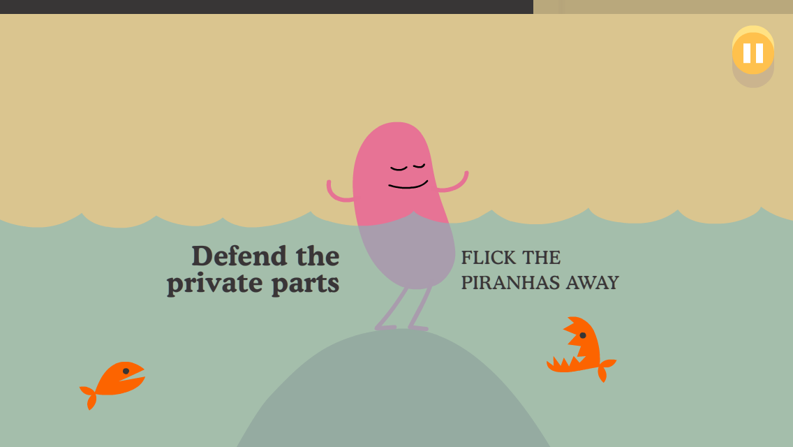
The campaign also included a game which could be played on smart phones was released, which featured tasks such as flicking away piranhas, taking toast out with a fork carefully, along with being patient while waiting in a car for a train to go past, and staying of the train tracks. It is the train related tasks which continue to drive the key message home.
Example of a task which is not related to the key message:
Example of a task which is related to the key message:
I think this game was successful because it was enjoyable to play, and engaged the player in tasks which were fun and satisfying to complete. As well as having a scoring system, the game also gave you three lives each time you played the game, which makes the game more tense, and encourages the player not to make any mistakes, therefore driving the message home even more. Another reason I think this game was successful was because it didn't focus purely on tasks related to the key message, I think if the game only focused on train safety, the player would feel to much like they were playing an educational game, which for some players would have taken the fun out of it. Since the game mixed in more imaginative ways of dying along with more realistic ways, the game was more fun to play.
It was also important that the game was released to be played on smart phone, since they are the most common type of the device anyone is going to own. The game was more likely to be played since it could be found easily on any app store, and it could be played for free. People especially like games which are free.
The campaign also included a website, which includes interactive tasks, including the game, and a second version of the game. The website also features latest news on the Campaign. The website also features a shop on which you can by merchandise related to Dumb Ways to Die. Merchandise includes a school bag, plushy toys and key rings.
I think the whole campaign targeted any one who used or is going to use Metro Trains, therefore in terms of age range, people 12 and upwards. Creative Director McCann also said that "The aim of this campaign is to engage an audience that really doesnt want to hear any kind of safety message...".
I think the campaign was successful on a whole because each different section of the campaign featured the same characters, who are all dying in the same stupid ways. It was the characters that became the campaigns brand, since the style of animation is very recognizable.
This campaign was created by NHS to inform people on how to act when a stroke strikes someone.
Here is the video for the campaign:
The video starts by showing a normal looking middle aged woman who is smiling. The video tells you that when a stroke strikes it spreads like a fire in the brain, it then shows an actual fire inside the woman's head, video then tells you that the longer the stroke goes on undetected the more damage is done. The video then tells you how to spot the signs of a stroke. You have to think and act fast. The video then tells what to do using the four letters from the word fast.
F - Face, the symptoms of a stroke shown in the face.
A - Arms, the symptoms of a stroke shown in the arms.
S - Speech, the symptoms of a stroke shown in speech.
T - Time, time to call 999.
Throughout the video, it incorporates music which would be well suited in a horror film, in order to make the audience feel uncomfortable, it also connotes the horrific reality of strokes. The video also shows a middle aged actor to demonstrate the three visual symptoms of a stroke. I think they chose a middle aged female actor because:
-middle aged people are more likely to get strokes
-middle aged people are more responsible, and are more likely to pay attention to the campaigns message
-females are stereotypical seen as weaker and will gain more sympathy from the audience.
The woman starts by smiling, which connotes that everything is OK, then she acts out the symptoms of a stroke in a frightening and disturbing way, which makes the audience feel uncomfortable. However, this makes the video more powerful, since people are more likely to be affected by disturbing things, since it brings them back down to the horrific reality we live in.
The video also uses the powerful imagery of a fire spreading in a person's brain, which connotes the urgency and danger of a stroke. The video at the end says that it is time to call 999, just like you would in the case of a fire.
Here is the image for the campaign:
The poster show cases the four things you need to which each start with the letters in the word FAST, just like the audio-visual advert does. For each symptom the poster shows an image relating to it directly. Also to link back to the audio-visual advert, the campaign again showcases a middle aged woman under a stroke attack. The poster shows the four things you need to do in relation to the word fast in a more effective way, by lining up the word FAST so that it can be read horizontally by the audience. Below the poster reads "WHEN STROKE STRIKES, ACT F.A.S.T" which is highlighted in the colour yellow, which connotes ideas of urgency and danger.
Over all I think the campaign was successful especially because of the word fast. The word fast first of all tells you that you need to act fast when someone is having a stroke, then the word fast tells you what to do. It helps audiences remember what to do in a more effective way then just plainly telling audiences what to in case of a stroke.
This campaign uses synergy, since the poster and the video advert share the same font, the same imagery and the same message throughout advert. Both adverts also explain the campaigns message in the same way, since the video advert explains what each letter of FAST represents. It is incredibly important that campaigns such as this one have synergy in order for the message to stick in people's heads more. This way the campaign has almost trained everyone who sees it to do what is needed when somebody has a stroke.
Idea number 1: Promotional Video for Native and the Name.
I would create a music video for the band, Native and the Name, which would be a video promoting them as a band targeted at audiences aged 16-25 who are interested in Indie/Folk. The video would be based in Sheffield therefore promoting Native and the Name as a Sheffield band, and would feature their most popular song which hasn't had a video made for them yet. I could also create a poster for the band, and also create a promotional website for them which show reels pictures of the band and also lets the user listen to their latest songs.
Idea number 2: Daniels Bros.
Daniels Bros are a local business in Sheffield who create wooden furniture, toys and memorabilia. Their most popular product are wooden penguins, which are marketed at both children (who use them as toys) and adults (who use them as decorations). If I were to create a campaign for Daniels Bros, I would focus on advertising the Penguins, because I think they are highly marketable.
The campaign I would create would include an animated video, a print out poster, and a web banner which would appear on websites which market similar materials to Daniels Bros. The video I would create would be a narrative advert, and would tell a story about one of the penguins Daniels Bros create which would appeal very strongly to the younger audience. The print out poster would appeal more to the older audience, by making the poster in the style of an B-Movie poster. The poster would act like an poster for the animated video advert, and would therefore need to link to the video, however would be made in style which can be interpreted as retro. The banner advert would be in the form of an animated gif, in order to attract attention, and would also be targeted at the older audience more.
Idea number 3: My Mum Paints Babies.
I would create a promotional video for a person I know called Kate Rose who is a talented artist based in Sheffield and paints peoples children for them. The video would need to be targeted especially at females, who are mothers and are also aged 30-40 this is because this is the type of audience that would desire a painted picture of their children. The video would show the process of the how My Mum Paints Babies works, by showing the delivery of a photo to the Kate Rose, and then show the time lapse of her painting the picture, and then show the picture being wrapped up and posted to the happy customer. The video would then cut to the customer withe her child receiving the painting. The other type of media I could use would be a brochure for My Mum Paints Babies, which would showcase the different paintings the artist has completed, along with the original photo of the child which is next to it, to show how accurate Kate Rose is at painting. The brochure would also show how much each painting cost, and would also give her email address and website for the people who are interested. I would also create a the website for My Mum Paints Babies, which would feature a show reel of Kate Rose's previous paintings.